When friends ask me how to get started in “digital humanities” research, I usually suggest making a spreadsheet. Frankly, when my friends ask me how to think through any kind of problem, I usually recommend making a spreadsheet. This is because “spreadsheeting” is a particular way of thinking.
Itemizing the details of the thing you’re trying to think about, whether it’s all the characters in a novel or or all the sushi restaurants you’ve been to, forces your thinking to become concrete and finite. You can put down each detail individually, and then examine the whole picture. It’s easy to draw conclusions horizontally (looking at one item across all its categories) or vertically (comparing all the items within one category), and to move between them. A spreadsheet can take fifty individual facts and turn them into a decision, just by organizing all the things you already knew.
But there’s more than one way to make a spreadsheet. Johanna Drucker recently called for more attention to the research “middleware” that structures how we present our research; her focus is on the platforms by which scholars share “finished work” with their audiences, but her concerns apply, too, to the tools by which scholars first present their own research results to themselves. Drucker outlines the following problem:
though platform structures are often used for their ease or familiarity, they imprint their format features on our thinking and predispose us to organize our thoughts and arguments in conformance with their structuring principles — often from the very beginning of a project’s conception (1)
The same problem holds, I think, with research tools generally — and certainly for the choice of spreadsheet software. Part of the antidote is simply to know what assumptions and choices have been built into the tools one is using, and so (drumroll please):
A Comparison of Spreadsheet Software
As a connoisseur of the form, I have spent a lot of time thinking about the structural assumptions built into Excel, Google Sheets, and Numbers (with a bonus round on plain CSV files).
Excel & Google Sheets
 Originally I was going to review these separately, but I made a spreadsheet to compare them, and most of their fundamental assumptions are strikingly similar. They are both moderately to severely hideous aesthetically, but boast incredible power.
I actually never use Excel any more; I lost Microsoft Office in a transition to a new laptop, and a combination of frugality and contrariness has kept me from purchasing it again. In some ways, I’m aware, this is cutting off my nose to spite my face: Excel is likely the most powerful spreadsheet tool. But Google Sheets is a solid substitute — it’s a little less awful-looking, and still has the tool I used Excel for most: pivot tables.
I mention the ugliness because it does impact how I formulate my ideas to myself as I’m encoding them. Both Excel and Google Sheets present you with an infinite scroll in every direction, of identical little cells with dark, solid outlines. (Google improves over Excel just by using dark gray for these boxes instead of black.) Starting out crammed into the upper-left corner, I often find myself adding more columns or rows of information than I actually need just because the space seems to demand it; my thinking gets as bloated as Excel’s file sizes. But then I start cutting down the detail within the cells, not wanting a wordy cell to push a whole row into being twice as tall as all the others. Neither of these instincts is a good one, since both let my sense of aesthetics override my accuracy.
The crowded, dark boxes make it harder to look things up, too. I can’t trust my eyes to follow a line through the visual clutter. There are options to set alternating row colours, which assists in horizontal look-ups, but the contrast between light and dark is so strong that it just overwhelms the vertical connections instead. Google Sheets provides only limited theme changes; Excel might allow one to set more detailed preferences, with an up-front investment in the design of a template, but it would be an advanced use. I usually end up physically touching my screen to mark my place… and end up a little less engaged and curious about the connections between the information I’ve recorded.
Despite these similarities, the two are, of course, not identical.
Differences between Excel and Google Sheets
The two implement pivot tables slightly differently. Google creates a new sheet within the spreadsheet for each pivot table, where it makes it easy to pivot the data but also easy to overwrite previous pivots with new ones. The pivots are cordoned off from the data and, if you are making a lot of them, somewhat ephemeral. Excel better enables a multiplicity of pivot tables– you can put pivot tables on the same sheet as the original data, or create a new sheet with lots of pivots. These tables, by being less isolated, are also more clearly contingent on the other data and easier to compare.
Both tools, already powerful, can be extended further. With Excel, automation and increasingly complex calculations are possible through a mystical ritual known as a “macro”, which I never fully determined how to implement. Excel macros are, evidently, a minor programming language, and thus come with infinite flexibility but a steep learning curve. Google Sheets adds advanced functionality through plug-ins; I’ve made use of a very helpful one which merged data between columns and could have been used for much more. These plug-ins have been developed and polished by third parties, making it quick work to begin using them and quick work to reach their limits.
More radically, Google Sheets is an online collaborative environment, which integrates with a wide number of other online systems. It’s marvellous for planning things with large groups of people — if you’ve never used a Google Form to automatically populate a spreadsheet with information, I highly recommend it. Excel files, in contrast, are awkward to email back and forth and clearly intended for individual, local use. It’s thus possible to create a casual, friendly spreadsheet in Google (like the one my roommate and I use to record our opinions of the sushi restaurants near our apartment), which would never make sense with Excel.
Numbers
The structural assumptions of Numbers are completely different. It is, frankly, not very good at many of the traditional tasks of a spreadsheet: it can’t make pivot tables, and it’s not even all that straightforward for making basic charts. Numbers is not interested in “power”.
I once spent several hours trying to debug some code which was only producing the first half of a spreadsheet, only to eventually realise (with horror) that the actual CSV output was fine: Numbers just refuses to allow tables with more than 255 columns, and, when opening the much larger sheet I’d created, it silently truncated the last hundred columns. I googled desperately, trying to convince myself that this couldn’t possibly be true, and this was the first search result:

It’s true. Numbers thinks that you couldn’t possibly need more than 256 columns of data.
And yet, I adore Numbers. The spreadsheet I created for this very blog post is, in fact, a Numbers spreadsheet. Numbers is a perfect toybox for data exploration.
The default aesthetics of Numbers are attractive without being distracting, which is an immediate plus. But the real key, for me, is that each table is only as big as the information you’re trying to put together. You can make several different tables, and move them around near each other, or connect them formulaically, or not. You’re not trying to shovel worlds of data into an all-encompassing Infinite Spreadsheet — you’re just jotting a few things down. So, it’s perfectly suited for throwing down ideas without totally knowing yet where they will belong, and adapting and re-adapting your organization to the new information that comes in.
As an example of this very different way to use spreadsheets, here’s one I use to keep track of the details of my newsletter:

It started with just the list of what titles I’d already used, to make it easier to avoid repetition when I chose the next title from my list of 100 Actual Titles of Real Eighteenth-Century Novels, and pretty immediately I realised that a list of which poems I’d included in the codas would be handy for the same reason. Later, I wanted to make sure I had some chronological variety to the poems, so I added the “year” column. The two-little-charts set-up let me sort the codas by year while leaving the titles sorted by order of appearance. And the third little chart keeps tentative ideas ready for official integration without mixing them in with the ‘official’ poem dataset.
Most importantly, I can look at all of these things at the same time, without having to do… well, this:
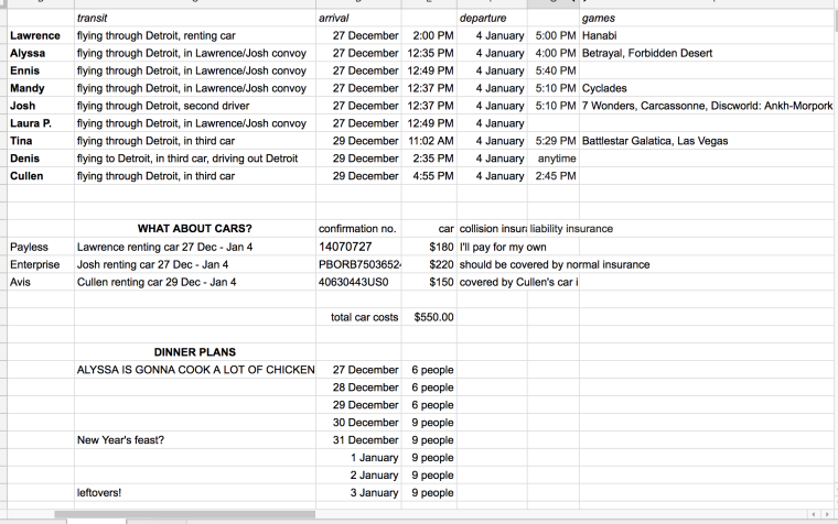
Hosting a nine-person, eight-day holiday house party is exactly the kind of venture for which I immediately prescribe spreadsheets. It’s also the kind of thing that demands to be planned in Google Sheets, specifically, so that multiple people can see and edit it.
It’s also also the kind of thing where lots of little independent tables would come in handy — which Google isn’t prepared for. Instead, we can choose between creating a ton of tiny hyper-specialized sheets (making it very hard to look at two kinds of information at once, e.g., to update the total number of people expected for dinner based on new arrival info) — or re-using columns and rows for different kinds of information, thus violating one of the key assumptions of spreadsheets. The above spreadsheet erroneously indicates that “confirmation no.” is the arrival date for an unnamed guest arriving by means of “WHAT ABOUT CARS?”; if I tried to sort any of the columns, the whole sheet would be thrown into disarray and rendered useless. It wounds me.
The Infinite Spreadsheet of blank cells is kind of a blank slate, so the above mash-up is at least thinkable, but Numbers makes for a much tidier toybox.
But not all spreadsheets are toys!
Okay, yes, a valid objection. I make a lot more tinker-toy spreadsheets than I do Monster Dataset spreadsheets, but when those monsters arrive, they tend to be much more important.
I haven’t yet figured out how to tell when one’s spreadsheet has reached the size and complexity that really calls for a database, but I am the proud custodian of a subset of the English Short Title Catalogue which consists of 51,861 rows. It’s short of the Numbers limit of 65,535 rows (of course Numbers has a limit) but it’s still cumbersome in both Numbers and Google Sheets. Even if it loaded in the blink of an eye, this spreadsheet has exceeded my ability to usefully read it to draw my conclusions. (Yes, I acquired this spreadsheet because there was way too much printed material for me to read, and now there is still way too much for me to read, Isn’t It Ironic.) Very little of the discussion above entirely applies to a spreadsheet which isn’t going to be read in its entirety.
Instead, I find myself leaving spreadsheet software behind, working with plain CSV files in a text editor like TextEdit or (my favourite) TextWrangler.
TextWrangler
A CSV file opened in a text editor is no longer the sort of thing you’re likely to edit directly — you can read and check it enough to know that the image on the left has a problem and the image on the right is in good shape:


But this is a file format which is structured for a program to find it simple to work with. So if you want to make major changes to the information inside it, or draw conclusions based on that information, you’re going to need a program.
In some ways, manipulating CSV files by hacking together Python code is like amping all of the principles of Excel to 110%: mighty, world-shaking power, at the cost of mighty, world-shaking hideousness and confusion. But if you can just get the code working, it’s beautifully simple. Excel doesn’t have that same breakthrough moment, where suddenly a complex four-hour task simply takes care of itself in milliseconds. (Or at least, I haven’t learned enough about “Excel Macros” to reach that breakthrough, and have abandoned that quest in favour of Python.)
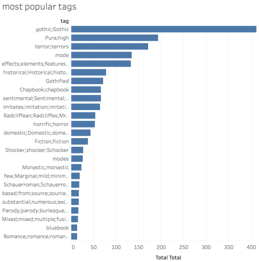
I also found, working with my data as plain CSV files and trying to write code, that the data itself began to feel wonderfully malleable. Take, for example, the operations of my Very First Program: each book in this spreadsheet has a sentence-length description of its “Gothic Type”; the program takes all the words that appear in all those “Types”, creates a column for each word (which I call a “tag”), and then consults each book’s “Type” to tally whether it includes each “tag.” This conversion process renders computable the interpretation I was already doing to mentally group all the works described with words like “sentimental” or “horror”. The program itself feels like a Rube Goldberg machine, slicing and duplicating and rearranging all the bits of information until suddenly I can discover that 77% of works identified as “sentimental” were written by women.
As a result, even though spreadsheets feel like a more “direct” way to interact with one’s data (since spreadsheets, after all, were actually designed for human use), it was the switch to CSV that let me feel that I could could use this data, and make it answer my questions.
So… what software do I recommend, to make and use spreadsheets thoughtfully?
The right answer, of course, is “all of the above”
My personal motto is “Why not both?” so naturally, in actual practice, I use all of these tools. Take, for example, the research question for which I wrote the program I mentioned above. I started with a bloated Excel spreadsheet from my MA research, which I pulled into Numbers so I’d have a beautiful environment while manually adding significantly more book data; then I exported it to CSV, and wrote my program to split the “Gothic type” column into several hundred columns, one for each unique word; I brought that CSV into Google Sheets (since there was a handy plugin to do just what I needed) to manually merge those columns into a much smaller number of “tags”; I pivoted the data in a second sheet of Google Sheets; I copied the resulting tables into Numbers, where I could easily transpose them and look at them in proximity; and finally, finally! I graphed it all in Tableau. My data spent time in four different environments — Excel, Numbers, TextWrangler, and Google Sheets — and usually passed through each environment more than once, before I could make it to this very rough chart:
While I was on this data rollercoaster, I found myself often thinking of one of Johanna Drucker’s earlier warnings, that “the concept of data as a given has to be rethought through a humanistic lens and characterized as capta, taken and constructed.” Although I have called it “data” throughout, it has all been captured — and not captured passively (like the way a camera captures events), but stalked across the savannah and run to ground for me to feast on its flesh!
Was there an easier way to get to my final endpoint? Probably, if I’d known in advance that I’d want to go through each of those steps in exactly that way. But shuffling my information from place to place, looking at it through different lenses, and manipulating it in different ways, testing all its affordances… that’s the process of research itself. Remaining fluid and mobile between the tools prevents my thinking from getting too firmly settled into just one approach. So instead of trying to find the One Perfect Tool, I focus on knowing how each tool will encourage its own kind of thinking, and choose accordingly.

One thought on “Spreadsheet tools as interpretive middleware”